New Business Branding
Savvy Kids Health Logo
GRAPHIC DESIGN


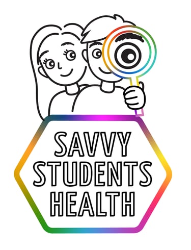
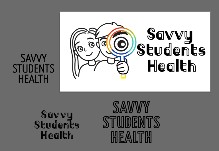
My first drafts featured a single character (a boy), but I realized the logo would benefit from greater inclusivity, so I added a girl character alongside him. After an initial round of feedback and revisions, the design direction became clear, and we finalized the illustration.
1. Background of Customer:
Name of Customer: Savvy Students Health
Type of Business: Health Coaching
Years in Business: Starting up
Target Audience: Students K-G12 and their parents
Unique Selling Proposition: Equip students with abilities to make positive choices in their health by fostering curiosity.
2. Problem to Solve:
Lack of branding (starting from scratch)
3. Solution:
Creating a logo
The client, based in Ontario, and I collaborated on this project through video calls, which allowed us to discuss her vision for the logo in depth. During our initial consultation, she shared her goals and target audience—students from kindergarten through Grade 12. To provide direction, the client shared a mood board featuring colours, imagery, and styles that resonated with her vision.
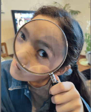
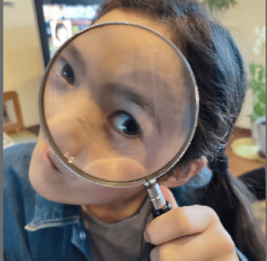
One key request was incorporating a colorful, curiosity-driven element—specifically, a magnifying glass motif. Inspired by this, I envisioned a playful yet approachable design. To bring the concept to life, I sketched out an image of a large eye peering through a magnifying glass. My daughter modeled for the pose, which became the foundation for the illustration.
Initially, the business was named "Savvy Kids Health," and the design reflected a more youthful, child-centric aesthetic. However, as the name shifted to "Savvy Student Health" to better include older students, I adapted the design to reflect this broader demographic. This included refining the face shapes and expressions of the characters to appeal to both younger children and teenagers.
Typography and Final Touches
Selecting the typeface required careful consideration to align with the brand's "fun and friendly" theme while maintaining professionalism. I curated a selection of fonts, ultimately landing on Yanone Kaffeesatz in an all-caps, outlined style. This choice struck the right balance—engaging without being overly casual or childish. The client preferred outlined elements, which we incorporated into both the magnifying glass and the typography.
To ensure flexibility, I delivered the final logo in multiple formats: landscape and portrait orientations, as well as colour and black-and-white versions. The result is a vibrant, approachable logo that embodies curiosity and inclusivity while appealing to a diverse age range.
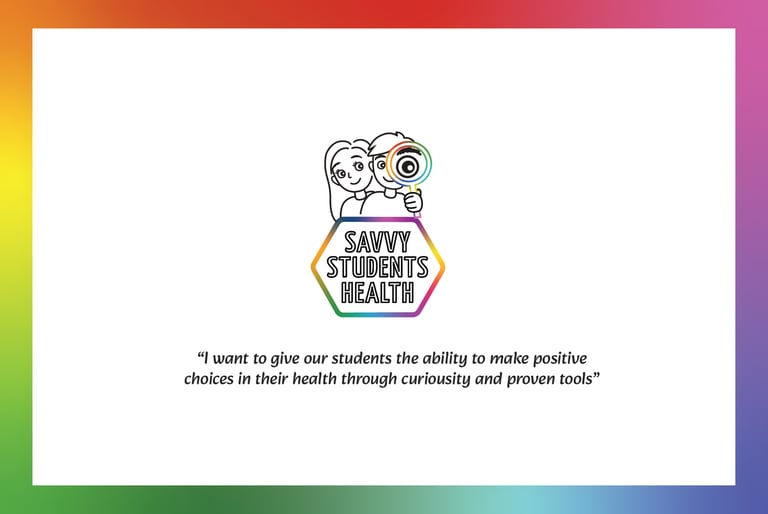
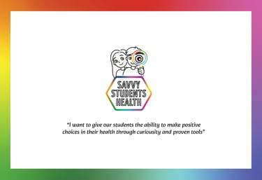
Marketing Material (postcard)
-She wanted to make a postcard to distribute to schools and other related places. She provided the copy and following is the final product.

